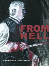
covers- BACCHUS no.18/19


Y esterday I was writing about those little advance cover images that I'd send for the previews catalogues. Once I acknowledged the unlikelihood of the first idea being the one that would make the eventual finished cover, it seemed inexpedient to go to the trouble of drawing it up in a 'finished' way. Also, since my covers were more often than not painted, an inked line version was surplus to requirements. Thus I decided to cut a corner. Instead of drawing a full size cover at this stage, I'd make a very small drawing that would look good at the repro size of two or three inches high. In other words, since the distributors were agreeably showing a picture in their jam packed catalogues, I'd make the most dynamic use of the available space by composing to best suit the scale, and think of my picture as a 'placeholder' for a better one that would come along later. There was a lady at one of the distributors who phoned to point out that I had delivered a cover different from the one advertised in the catalogue, which was against the rules. I responded by pointing out that the rule was a sound one designed to stop publishers from offering , say a brilliant cover by Dave Stevens and then delivering a dumb one by Eddie Campbell, thus causing discontent with the readers who would naturally feel gypped. Since I had promised a cover by Campbell, and then delivered a more detailed cover by Campbell, I wasn't playing against the purpose of the the rule. I presume the matter was referred to somebody who knew who Eddie Campbell was, and no more was heard about it at this end for the rest of my duration as a publisher.
Anyway, after that first year of self publishing, most of those solicitation images were quite different from the covers as later published. Above are a couple of good examples. You can see how in the small versions the bold and simple black and white miniatures command their space more authoritatively, while if you click through to the bigger version, the colour image comes into its own. The Issue #18 (oct. '96) preview has a profile of Bacchus that is almost bigfoot cartooning. I tend to prefer it to the finished picture. The Subject of #19 (nov.'96) was so suited to Pete Mullins' skills that I handed it over to him and kept out of the way, so that one's 100% Mullins. The small girl's head sufficed until I or Anne found a photo ref for the finished image. With that issue Mick Evans finally got to redesign the logo after complaining about it for a year. 'Colo' was of course our version of the popular British mint, 'polo'. The story in this episode was one that Marcus Moore wrote for me, about the invention of a mint for inserting in your posterior, or the 'arse-mint.' Forever after, in the pages of Bacchus, Marcus was referred to as 'Minty Moore'.
(That's after 'Dinty' Moore, who was the chef in the great Bringing Up Father daily comic strip. There's a great site devoted to it, courtesy of Mark J. Holloway, including Dinty Moore way down the page.)
*************
Short Is Good: The concise joys of condensed books -- and the virtues of brevity
Wall Street Journal-May 12-By TERRY TEACHOUT
NEW YORK -- "Orion Books, one of England's top publishing houses, has just brought out the first six titles in a series of abridged versions of such classic novels as "Anna Karenina," "Moby-Dick" and "Vanity Fair." The covers of these paperbacks, which have been shortened by as much as 40%, bill their contents as "Compact Editions."
Of course great art deserves to be experienced on its own uncompromising terms, flaws and all. But the older I get, the more I appreciate those artists who say what they have to say, then shut up. Is there a more powerfully moving novel than F. Scott Fitzgerald's 56,000-word "The Great Gatsby"? Or a funnier film than Buster Keaton's 44-minute "Sherlock Jr."? Or a more profound meditation on the brevity of human life than "Anakreons Grab," Hugo Wolf's setting of Goethe's 12-line poem about the grave of an ancient Greek poet? "The happy poet rejoiced/In spring, summer and fall/Now at last this mound of earth/Protects him from winter." I'd trade any number of operas for that exquisitely wrought three-minute song."
*********
European men are flocking to Bulgaria to buy 'breast-boosting beer' after EU accession led to customs duties on the drink being abolished
Constantin Barbu crossed the Danube from Romania to buy Boza in the Bulgarian border town of Ruse.He said: "I've bought a case for my wife to try out. I really hope I see an improvement."
Labels: Bacchus 1, Bacchus 2, covers-1, Pete Mullins
posted by Eddie Campbell at
00:34
![]()
![]()


6 Comments:
I think I prefer both of the intial sketches on these ones.
I think I do too. You're a wise man mister White.
thirded. I always liked the impact of the b/w catalogue images - didn't you lose heaps of them along the way? thinking they had served their intended purpose and discarding 'em, or something.
oops, hadn't read yesterday yet. delete me, campbell.
The first two illustrations are great. The first one, especially.
The best "condensed" books I ever read were the surprisingly excellent CLASSICS ILLUSTRATED from the Gilbert Company.
The first text-only condensed book I ever read (only one I ever read) was the Reader's Digest condensed version of Peter Benchley's JAWS. It was pretty well done, as I recall.
Colo
that distressed my sister a good bit
i was wondering why he was called minty
Post a Comment
Subscribe to Post Comments [Atom]
<< Home